The cross-effector network
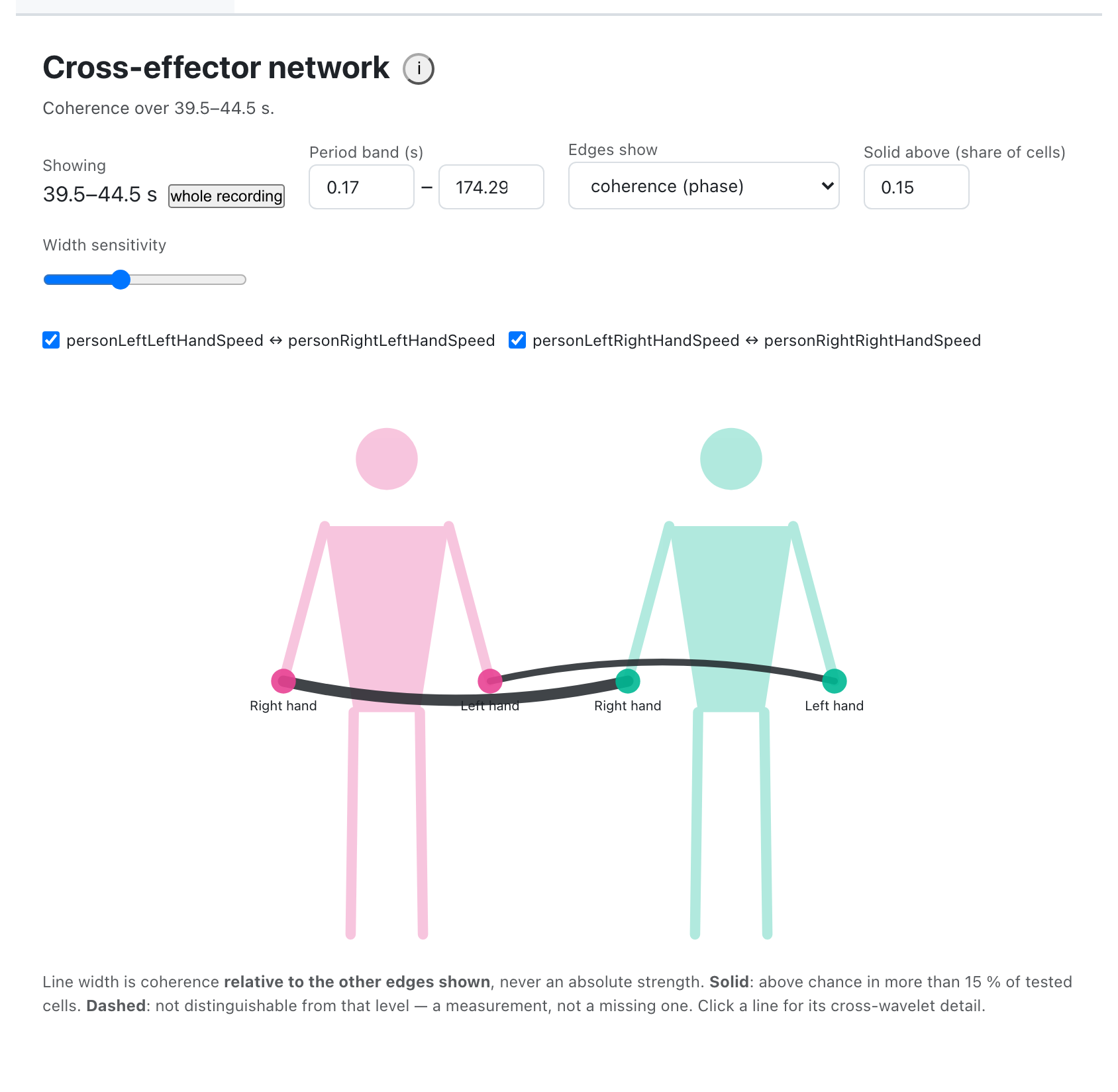
One picture of who is coupled with whom, following the playhead. Each node is a measure; each edge is how strongly two measures went together over the window around the current moment. Move the playhead and the picture changes.
An edge can answers one of two questions, and you choose which. Coherence asks whether the two held a steady phase relationship. Shared power asks whether both were moving at all at that timescale. They are different questions and they disagree in the case that matters most — see the two modes.
It is a view of the cross-wavelet analysis, not a separate one. Everything it
draws comes from assets/crosswavelet/{video}_crosswavelet_data.json, so an
edge exists only where include_crosswavelet asked
for that pair.
- Tab id
network, gated byinclude_network. - Needs the cross-wavelet analysis. Coherence mode needs its coherence chance level; shared power mode does not.
- Needs
figure-geometry.js, which draws the body and the fan of edges. Without it the tab reports that rather than drawing —dims-case syncwrites the script tag for you. - Reads nothing else: no raw signal, no config beyond
include_network— except the Window Size control, seeded fromdefaultWindowSize, for how wide "the moment" is.
The window is the playhead ± half of the Window Size control, which starts
at defaultWindowSize (5 s unless the study says otherwise) and follows the
control from then on. A whole recording button above the picture appears once
you have picked a moment and takes you back to averaging over everything, for
when you want the study rather than the moment.
Reading an edge
Four things are drawn on one line, and they answer different questions.
| channel | means |
|---|---|
| thickness | the mode's measure over the window and the period band — but relative to the other visible edges, not absolute |
| solid or dashed | solid where the measure beats its 95 % level in at least 15 % of tested cells; dashed where it does not. That share is a control |
| colour | nothing, except the one edge you have selected |
| curvature | nothing — it is there so you can tell edges apart |
Every edge is bowed, and no two by the same amount. That is presentation only.
Straight lines between nodes on one body are the same line, and cross-body edges
all cross the middle and arrive at a node as a smear; fanning the set is what
separates them. A large fan tightens rather than sweeping out of frame. The
constants are in reference/figure-geometry.md.
Thickness is relative on purpose. The width scale pivots on the mean of the currently visible above-chance edges, so the picture answers "which of these couplings is strongest here" rather than "what is the absolute number" — which is what the tooltip is for. It also means the same edge can look different after you hide another one. The "width sensitivity" slider controls how hard the scale pushes.
Dashed means the measurement said nothing. An edge is called real when at least 15 % of its tested cells beat the 95 % level, and drawn as a dashed hairline when it is not. That share is the Solid above (share of cells) control, and it is worth understanding rather than accepting.
Solid above: what the number is
It is a share of cells, not a level. The level is fixed at 95 % and comes from the analysis. What this control sets is how many of the cells that were tested have to beat that level before the tab is willing to call the edge real.
A cell counts as tested when it survives four filters: its period is inside the Period band, its column is inside the window at the playhead, it lies outside the cone of influence, and its period has a usable 95 % level at all. So "tested cells" is smaller than "cells in the window", and both controls above change it — narrowing the band changes the denominator as well as the numerator.
Why not 5 %. Under the null, 5 % of cells beat a 95 % level by construction — that is what the level means, and the tooltip says so beside every edge. Setting the control there would make the test "did this edge behave at least as well as noise", and because the fraction is itself an estimate that scatters around 5 %, roughly half of the genuinely at-chance edges would come out solid. 0.15 is three times chance, chosen to sit clear of that scatter.
Why it is remembered per mode. The share of cells above a sampled coherence
chance level and the share above an analytic red-noise power level are
different distributions. One number would judge one of them by the other's
yardstick, so each mode keeps its own, seeded from include_network.threshold
and remembered as you switch back and forth.
What the ends do. At 0 every testable edge is solid — the test becomes "was even one cell measured". At 1 nothing is solid unless every tested cell beat its level. Neither end changes a single measured value: this control sets a verdict, not an answer, and the number in the tooltip is the same either way.
It is not presentation only. The width scale pivots on the mean of the visible, above-chance edges, so moving this control changes which edges are in that pool and therefore re-scales every solid edge on screen. It sits between the two presentation controls and behaves like neither.
It cannot rescue an untestable edge. An edge whose payload carries no usable level has no fraction to compare, so no threshold reaches it — see below.
The third verdict
An edge whose payload carries no level at all is untestable — drawn, but its
tooltip says the value cannot be tested and names the fix, and when every edge is
in that state the tab says so above the picture rather than letting an untested
picture pass for a tested one. In coherence mode the fix is
analysis.crosswavelet.mcCount and a rebuild; in shared power mode it is not,
because that level is computed rather than sampled.
Every edge's numbers are in its tooltip: the pair, the mode's value, the period band it was averaged over, the share of tested cells that beat the level and how many cells that was, what independence would have given (about 5 %), and the other mode's value for comparison.
The widths themselves run from MIN_WIDTH = 1.5 px at the bottom of the visible
range to MAX_WIDTH = 16 px at the top. The node they end at is deliberately
small — TAB_NODE_R in figure-geometry.js, under half the radius the wizard
uses for the same body — because the wizard's circle is a drop target and this one is the
end of a line, and a big dot eats the width channel.
Every edge is a curve, and no two curve alike. Ranks are handed out across
the whole set on screen and each edge bows perpendicular to its chord by its own
amount (bowRanks, bowStep and edgePath, all in figure-geometry.js, which
the wizard's diagram draws from too). Straight lines between nodes in a column
are the same line — three edges drawing one bar — and edges that merely meet at
a node arrive as a smear. Separating only the edges whose endpoints match is not
enough; it leaves every other edge at the minimum bow. Past about sixteen edges
the fan tightens rather than sweeping arcs out of the frame.
The controls above the picture
| control | what it does |
|---|---|
| whole recording | a button, shown only once you have picked a moment, that clears the playhead and averages every edge over the entire session |
| Edges show | coherence or shared power. This changes the question, not its presentation |
| Solid above (share of cells) | the share of tested cells that has to beat the 95 % level before an edge is drawn solid. Remembered separately for each mode, and it re-pivots the width scale — see above |
| Period band (s) | the shortest and longest period each edge is averaged over. This changes the answer, not its presentation: it selects which cells enter both the mean and the significance fraction |
| Width sensitivity | how hard the relative width scale pushes. Presentation only |
| one checkbox per pair | hides an edge. Fifteen edges is a lot to read at once, and hiding some also re-pivots the width scale, because it pivots on what is visible |
Coherence needs a chance level to say anything at all
Coherence does not sit at zero when there is no relationship — two unrelated signals score around 0.25, not 0. So a network of raw coherence values draws at-chance noise as findings and looks entirely convincing doing it.
Switching the network on therefore switches on the Monte Carlo null at 100
surrogates, because coherence mode is the only thing that reads it. Without it
every edge is untestable in that mode and the tab says so rather than guessing.
The null, and what it assumes, is documented under
cross-wavelet.
Shared power mode is not affected: its level is computed from the two series' own red-noise backgrounds rather than sampled, so it is in the payload either way.
The two modes
Coherence asks whether two measures held a steady phase relationship. It is amplitude-normalised by design, so a tiny shared tremor scores exactly as high as a large shared movement — a thick coherence edge can be two nearly-still measures whose jitter has a shared source, which is the common case when both are tracked from one video. No period band separates that: the band selects which timescales enter the mean, and every cell in it is equally amplitude-blind.
Shared power is what does separate it. The cross-wavelet transform is
W₁·conj(W₂), so its magnitude is exactly |W₁||W₂| — the product of the two
amplitude envelopes, and nothing to do with phase. Each cell is divided by
signif_xwt, its own period's red-noise level, and it is those ratios that are
averaged — a mean of ratios, not a ratio of means. That matters because the level
varies by orders of magnitude across periods, so dividing once at the end would
let the longest periods in the band decide the answer. The result is
dimensionless, comparable between pairs, and significant exactly where it
exceeds 1.
A period whose level is missing or non-positive has no defined ratio, so in shared power mode those cells leave the average as well as the test. In coherence mode they leave only the test — a coherence value is still a value without a threshold to judge it against.
So a thick power edge means both measures were busy — not that they were coupled. Two people waving vigorously and independently make a fat edge. The diagnosis is the pair of readings, which is why the tooltip carries both numbers in either mode:
| coherence | shared power | reading |
|---|---|---|
| high | high | a real shared rhythm, with something behind it |
| high | low | phase-locked stillness — the case to distrust |
| low | high | both active, unrelated |
Width in power mode ranks the edges on a log-like scale rather than reading out the ratio, because the ratio is unbounded and a linear scale would clip every edge above its level to the same width. The ratio itself is in the tooltip.
Shared power needs no Monte Carlo null. Its level is analytic, so it is in
every payload — a study built without mcCount can still be read this way, and
the tab says so rather than showing an untestable picture in both modes.
Clicking an edge: the detail figure
Selecting an edge does two things. It colours that line — the only use of colour in the picture, so "selected" reads as a state rather than as another measurement — and it draws that pair's cross-wavelet figure underneath the diagram.
The detail figure is of a moment too, and its window follows the playhead. It is drawn once, when the edge is selected, and afterwards only the shaded window is moved: two answers to "which moment am I looking at" on one screen, where the wrong one has a box drawn round it, is worse than one.
The figure is the cross-wavelet tab's, borrowed. In a dashboard built without that tab there is nothing to borrow, and the panel says so rather than drawing an empty figure.
Where the nodes go
Two layouts, chosen with layout:
columns(the default) — one column per group, members spread down it.figure— one human figure per group, with each measure on the body part it belongs to:head,nose,lefthand,righthand,hand,torso,hip,foot. Anything with no part is stacked beside the figure rather than dropped.
Neither layout is force-directed, deliberately: a force layout moves nodes between frames, and this picture is read by comparing one moment with another.
Building it in the wizard
The no-code builder draws this diagram in step 4 and asks you to fill it in, which is the same decision as writing the config below by hand.
- Add a person for each figure you want, and name it. That is a
group. One is enough: a network of a single body's own effectors — hands with head, left with right — is a whole network, and the tab centres the lone figure. Be aware that the default 15 % share was chosen against between-person data; whether it reads the same way within one body is an open question rather than a settled one, and the "solid above" control is there to move it. - Click an empty circle — head, either hand, torso, hip or foot — and pick a
time series from the list. That is one
effectorsentry, and the node takes the spot's own name as itslabel: Left hand, Head. Real measure names are long enough that neighbouring nodes overlap into a smear, here and in the dashboard; the full name stays in the node's tooltip. The picker closes on Escape or a click outside it, without placing anything. - Drag from one placed node to another to ask for the coupling between them. A dashed line follows the pointer; releasing on the second node makes the pair. Clicking the two in turn does the same, and draws the same line while you are between clicks. Escape, or releasing on empty space, abandons it.
- That line is one
include_crosswaveletpair, which is what the tab turns into an edge; without it two nodes are simply two nodes. The same pairs are chips in the cross-wavelet block above, and the two are one list — either view edits it and both redraw. So a pair can be asked for without ever touching the diagram, and a pair whose measures are not both placed is selected but not drawn (the summary line under the chips says how many are in each state). - The
×on a node takes it back off. Its lines go with it, because a line needs two placed endpoints — but the pairs stay selected: where a measure sat on a body is not whether to analyse it.
Choosing the figure layout is not a separate step: placing anything on a body
means layout: "figure", because a body diagram that configured a column chart
would be a lie.
An existing study opens already filled in. Every study written before
effectors existed says all of this by naming its measures
teacher_righthandspeed, so the wizard runs the same inference the tab runs —
the group's regular expression for the person, a body-part token in what is left
of the name for the spot — and shows you the result, saying that it guessed.
Pressing Next writes it out in the explicit form. The two render identically;
that is asserted by a test, because a migration that quietly moved a node would
be worse than no migration.
Saying which series is which node
By default the tab infers everything about a node from its name — the group from a regular expression, the label by deleting that expression, the body part from a token found somewhere inside what is left. That works when a study encodes person, part and quantity in one string:
"include_network": {
  "groups": [
    { "label": "Teacher", "match": "^teacher", "color": "#e84393" },
    { "label": "Student", "match": "^student", "color": "#00b894" }
  ],
  "layout": "figure"
}
…with measures called teacher_righthandspeed and student_nosespeed. It says
nothing useful about a study whose measures are called bodysync and
neuralsync: they match no group and contain no body part, so every measure
lands in one undifferentiated column.
effectors says it outright instead.
"include_network": {
  "groups": [
    { "label": "Teacher", "color": "#e84393" },
    { "label": "Student", "color": "#00b894" }
  ],
  "effectors": [
    { "series": "teacher_righthandspeed", "group": "Teacher",
      "label": "Right hand", "part": "righthand" },
    { "series": "teacher_nosespeed", "group": "Teacher",
      "label": "Head", "part": "head" },
    { "series": "bodysync", "group": "Student",
      "label": "Body", "x": 0.72, "y": 0.40 }
  ],
  "layout": "figure",
  "band": [0.0, 12.0]
}
| field | what it is |
|---|---|
series |
the data type, exactly as in dataTypes and in assets/timeseries/{video}_{series}.csv |
label |
what to draw under the node. Defaults to series |
group |
the label of one of the groups above — no regex involved |
part |
where on the figure it sits. Ignored by the columns layout |
x, y |
position as a fraction of the chart, 0 to 1, overriding part |
When effectors is given, a group needs no match — it is referenced by label.
When it is absent, nothing changes: the inference above is exactly what it was.
Two groups must not share a label. It is the only thing an effector has to
name its group by, so a duplicate is not a cosmetic problem: the tab resolves a
label to one group, and the other one keeps no members and is not drawn — its
measures appear on the survivor's figure. The wizard refuses to write such a
config, naming the label, and its own default names cannot collide. A config
written by hand can still do it.
series must stay a real data type name, not a display name. A node is
matched to its cross-wavelet pairs by that name, so a label here resolves against
no pair: the node is drawn with no edges, and the measure you meant turns up
again in the trailing Other group. That is what label is for.
x and y are fractions, not pixels. The chart's own dimensions are private
constants of the tab that have been retuned before, and a config written in raw
units would drift the day one of them moves. In the figure layout, omitting
x keeps the node on its own figure's centre line — which is the only way to say
"on this person, lower down", because an explicit x is absolute and does not
follow a figure when a third group is added.
What happens when a declaration and the data disagree
Both directions are drawn rather than silently resolved, because both are questions only the study can answer:
- A declared effector that appears in no cross-wavelet pair gets a node with no edges. You asked for it and the analysis does not cover it.
- A measure that appears in a pair and that no effector declares gets a node
in a trailing
Othergroup, exactly as an unmatched name does. - An effector naming a group that no group defines is a typo, not an
instruction to invent a column, so it also lands in
Other.
The wizard checks these before it writes a study: a series with no CSV and a
duplicated series are errors; an unknown part and an undefined group are
warnings.
Where the drawing lives
The body — its coordinate space, its six places, the aliases for their names, the
lines that make a figure, and the fan the edges are bowed along — is
packages/dims-tabs/figure-geometry.js,
documented at reference/figure-geometry.md.
To move a body part, change it there. Two things draw that figure and they have
to agree to the pixel, because what you arrange in the wizard is what the dashboard
draws: this tab reads its own vendor/dims-tabs/ copy, and the wizard is served
the checkout's at /vendor/figure-geometry.js. A study keeps its vendored copy
until dims-case sync, which refreshes both the directory and the index.html
that loads it — so a change reaches the wizard at once and a built study when it
syncs.
The rest of the config
| key | what it does |
|---|---|
groups |
how the measures divide. label, an optional color, and a match regex when you are not declaring effectors. The wizard writes no match of its own; it carries one through if a study already had it |
band |
period band in seconds, [low, high], to average each edge over. This changes the answer, not its presentation — it selects which periods enter both the mean and the significance fraction |
mode |
which measure the edges start on: coherence (the default) or power. The control above the picture switches it; this is only where it opens |
threshold |
the share of tested cells that has to beat the 95 % level before an edge is solid, as {"coherence": 0.15, "power": 0.15}. Either key may be omitted |
layout |
columns or figure |
include_network: true means "on, with everything inferred".
The full shape, with every constraint, is in
docs/contracts/config.schema.json.